In reality, candlesticks are simply a different way of analyzing price data compared to traditional line charts. These charts provide more detailed insights into market movements, offering additional data and actionable signals. However, mastering candlestick charts takes time, and this method may not be ideal for beginners just starting out.
In this article, we’ll break down how to read candlestick charts, explore their benefits for different types of investors, and show you how identifying key patterns can help you make profitable trading decisions.
What Is a Candlestick Chart?
A candlestick chart may sound like a new, advanced form of stock research, but it’s actually an old way of gauging market sentiment, developed by Japanese rice traders in the 1700s. Each candlestick contains a cylindrical body with two lines (or wicks) attached to each end. All four levels of the candlestick provide different pieces of information. For a green bullish candle, you'll learn the following:
- Top Wick: High of the session
- Top Body: Closing price
- Lower Body: Opening price
- Lower Wick: Low of the session
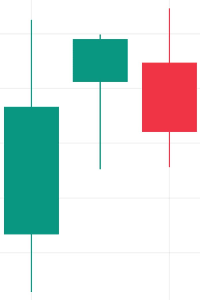
On a red bearish candle, you'll learn the same four data points: the lower portion of the candle body represents the close, and the upper body represents the open. Green candles mean the price ended the session higher, while red candles mean the price closed lower. Some analysis tools won't have color-coordinated candles; in these cases, hollow candles are bearish and opaque ones are bullish.
Additionally, a candlestick session can range from as short as one minute to as long as a month. For day trading, the timeframe is typically set to five minutes, while swing trading often uses a full market session—though certain strategies may call for alternative timeframes. This flexibility in candlestick investing is one of the reasons it’s a favored approach for many traders.
What Are Candlestick Charts Used For?
If you can read stock charts, you likely engage in technical analysis, which uses volume and price data to locate patterns that predict future market movement. The most commonly used technical indicators incorporate moving averages of prices to form oscillators, such as the Moving Average Convergence Divergence (MACD) or the Relative Strength Index (RSI). Indicators like MACD and RSI detect changes or continuations in price trends so traders can make informed predictions.
A stock candlestick chart can also send signals to traders, but these patterns form slightly differently than those on the MACD or RSI indicators. Traders who know how to read candlestick charts look for certain shapes or patterns to form over a few consecutive sessions. In contrast to security analysis tools like RSI, which often require weeks of price data, candlestick signals often appear after only two or three periods because sentiment is also measured through the analysis of the multiple highs and lows of the period. If you learn how to read a candlestick, you can add a new form of security analysis to your toolkit.
Basic Candlestick Patterns
What is a candlestick trading signal? Traders and investors look for dozens upon dozens of signals when analyzing asset prices. Still, novice traders can practice a few simple ones on paper money simulators before putting any capital to work. Here are five classic candlestick patterns for bearish, bullish and neutral trades across assets and stock sectors.
Bullish Engulfing
One of the more easily recognized stock candlestick patterns is the bullish engulfing signal, which signals a downtrend reversal could be on the horizon. The pattern, called "engulfing," involves two consecutive candlesticks, with the second completely shadowing the first. The second engulfing candle should have a body encompassing the entire area of the first candle from the intraday high to the intraday low.
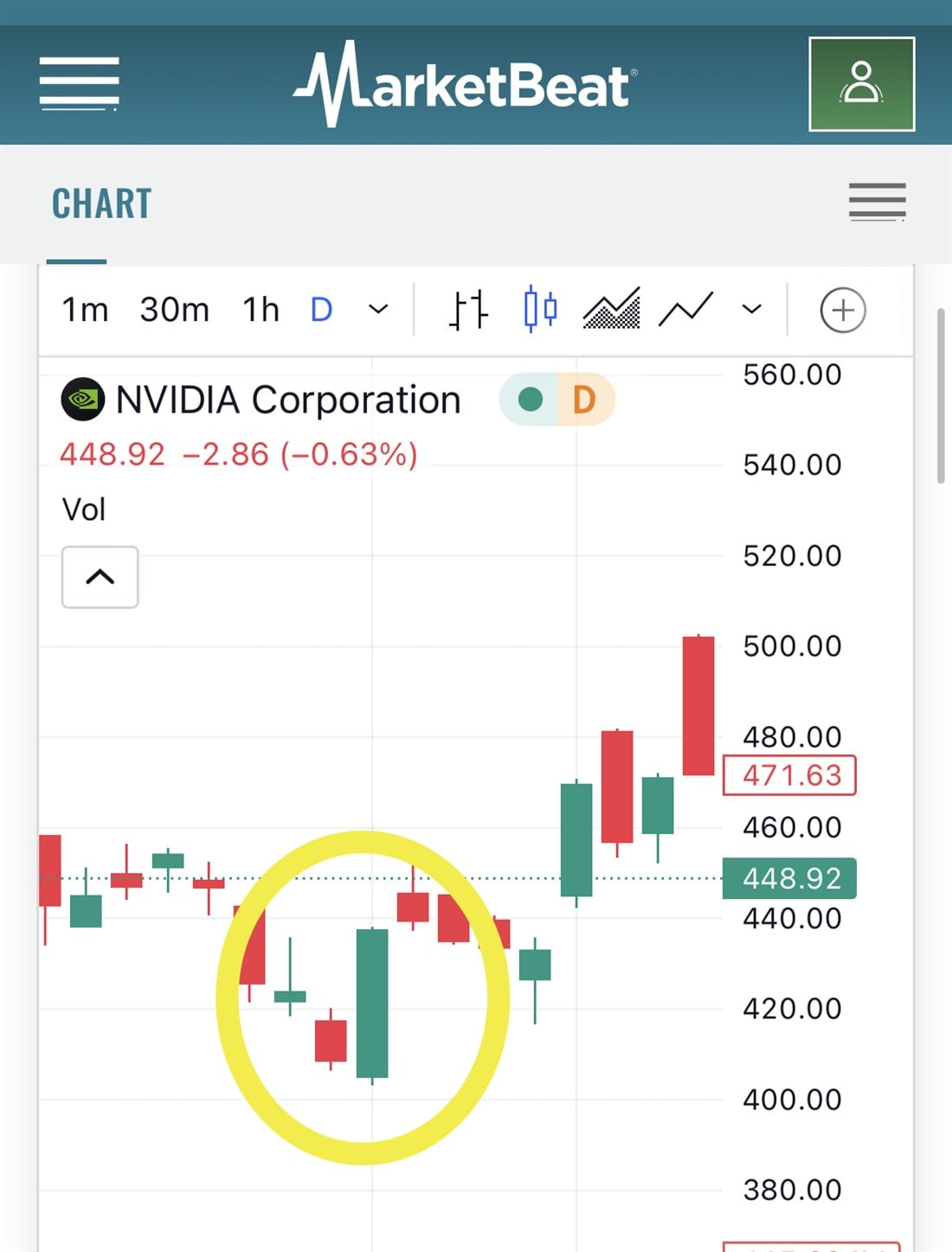
On this daily NVIDIA Corp. NASDAQ: NVDA chart, the circled large green candle completely envelopes the previous day's red candle. This indicates that buyers have a groundswell of support and could be in a position to control the trend. Over the next few days, NVDA built on this upward momentum and traders who entered a position when the bullish engulfing pattern formed were rewarded.
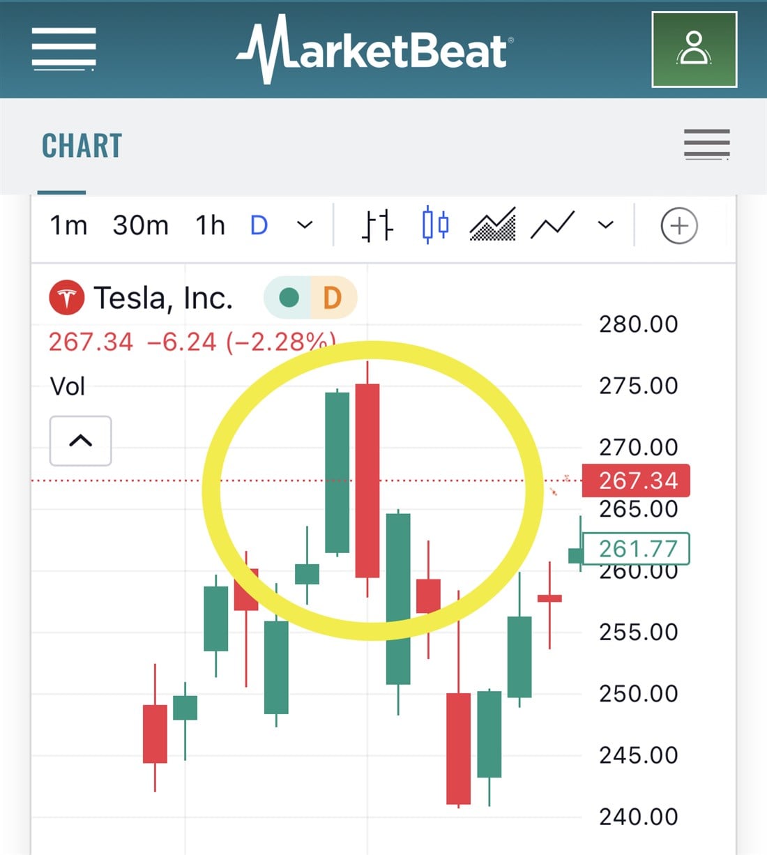
Bearish Engulfing
The downside twin of the bullish engulfing is (you guessed it) the bearish engulfing pattern. Unlike the candle chart pattern above, this one forms at the end of a momentum upswing and signals that buyers may be starting to thin out. The Tesla Inc. NASDAQ: TSLA daily chart below shows the highlighted bearish candle engulfing the previous day's bullish candle. When the body of the second candle completely covers the first candle from wick to wick, it could indicate the stock price is about to drop.
Hammer
Our following candle trend pattern is the hammer, a single candle signal that could indicate a downtrend reversal. On the Microsoft Corp. NASDAQ: MSFT daily chart below, the yellow arrow points out a large green candle with no wick above the body of the candle.
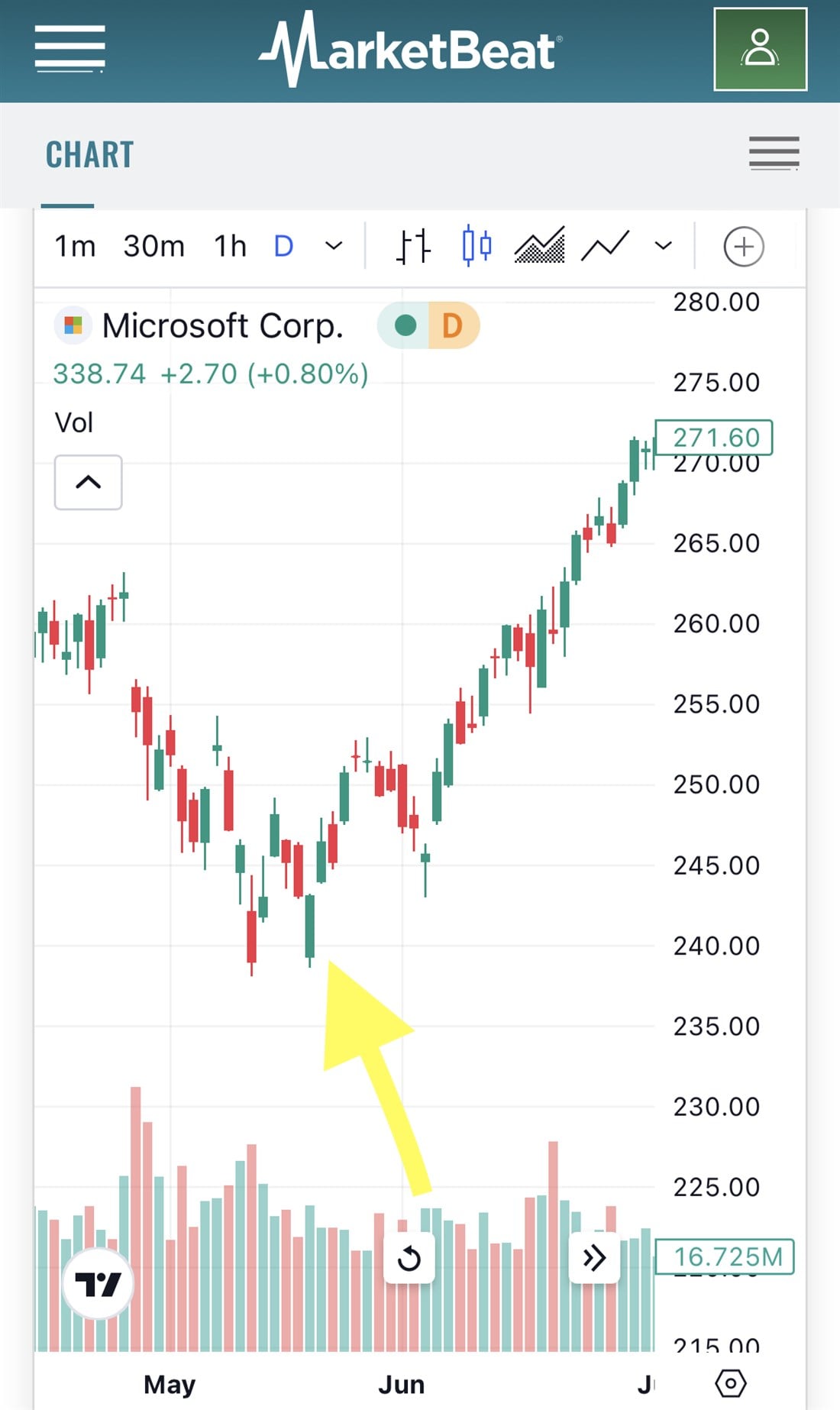
What does a hammer tell us? Since there's no wick at the top of the green candle, it shows that while there may have been jockeying throughout the session, buyers ended the day in control and pushed the stock's price into the close. The hammer is a bullish reversal candle, meaning that its appearance could signal the end of a downtrend. In the case of Microsoft, the stock rallied from $240 to $271 in just about four weeks.
Shooting Star
The shooting star is a bearish red candle that looks like the mirror image of the bullish hammer candle. This candle often forms when an uptrend loses steam and the price is about to reverse downward. Like the hammer, there’s only one noticeable wick on the shooting star, this time on top of the candle.
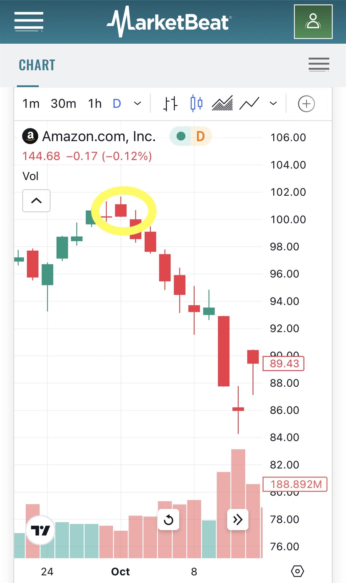
Since there's no wick on the bottom of the candle, the price is closed at the low of the day with sellers in firm command. On the Amazon.com Inc. NASDAQ: AMZN daily chart, a shooting star candle formed in October 2021 preceded a 10% decline in share price.
Doji
Traders may consider the Doji an "uncertainty" candlestick, meaning that the market's direction is in flux, with neither buyers nor sellers taking control. The Doji is conspicuous because it resembles a plus symbol with a flat body and long wicks.
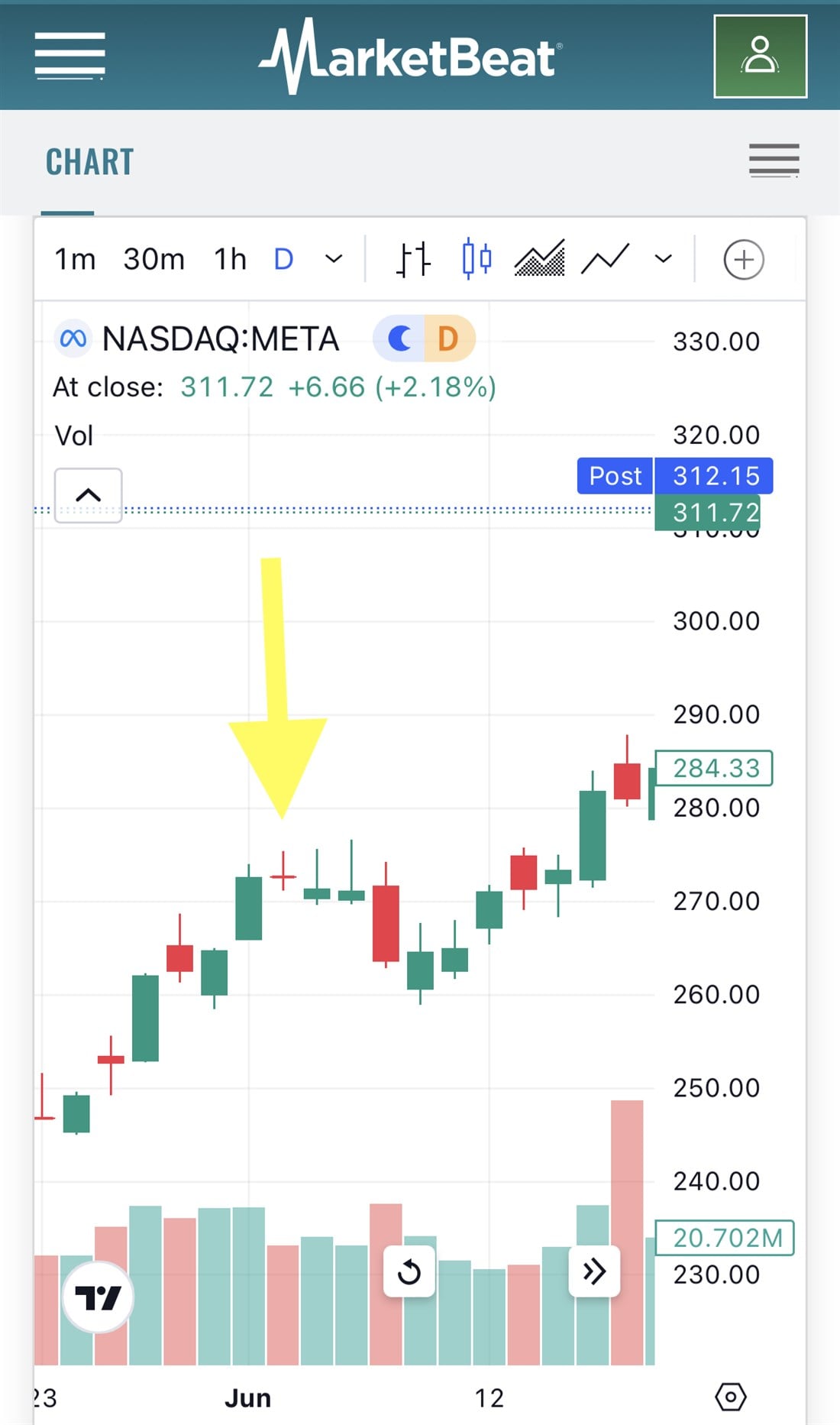
While some variations of the Doji can be bullish or bearish, a candle with equally wide wicks and a thin body usually indicates indecision, which traders often interpret as a continuation signal. On the Meta Platforms Inc. NASDAQ: META daily chart, the Doji appeared in the middle of an uptrend, and the price stagnated for a few days before resuming its path upward.
How to Interpret a Candlestick Chart
Which candle is best for trading? The answer, of course, depends on your timeline, goals and risk tolerance. Candlestick stock charts are widely used because of their versatility, allowing traders and investors to set their timeframes and combine their analysis with various technical indicators.
To interpret a candlestick chart, you need first to identify the length of the period. Each candle could be a trading session or a one to five-minute increment, depending on the chart. Looking at daily candles on a year-to-date chart probably won't provide much value if you want to day trade. Make sure you understand the time interval before drawing any conclusions.
Next, you'll look for market signals through the lens of psychology. One of the reasons candlestick stock charts gained popularity is they didn't just relay price points, but the range of market sentiment felt throughout the period. Did the stock close at its high or low of the day? If you're looking at a bullish candle, how wide was the gap between intraday high and close vs. the intraday low and open? These psychological clues and common technical themes like support and resistance can help you find high-probability entry and exit points on trades.
Candlesticks vs. Line Charts
Line charts provide a bird's-eye view of an asset's price movements. You can see the range of closing prices over time and make informed decisions about long-term trends and market health, but you won't gain any insight into the day-to-day movement of an asset's price nor any reads on the volume of shares traded.
Candlesticks show opening and closing prices and the range throughout the day by including the intraday high and low. Larger candles indicate volatile sessions, and volatility is often a precursor to volume (and vice versa).
Candlesticks vs. Bar Charts
In stock trading, a bar chart isn't the same as the one you’d make in a PowerPoint presentation; it looks like this:
Bar charts tell traders the same information as candlestick charts: the open, close, intraday high and intraday low. But despite their similarities, many day and swing traders prefer candlesticks because the candle's body makes patterns easier to spot (especially engulfing patterns like the ones described above).
Utilizing a Candlestick Chart
When incorporating candlestick charts into your trading plan, it's important to know how to identify patterns and how candlesticks reflect price movements.
How to Identify Patterns
Unlike technical indicators, which require at least 10 to 20 different session data points, candlesticks send signals when a specific shape or combination appears on the chart. In the case of the Doji or Hammer, this can be a single period during which the particular shape of the candle gives hints about the psychology of the market and how buyers and sellers act.
Once you conquer how to read candle charts, you'll begin seeing these patterns everywhere, so you'll need to confirm the signals with other securities analysis tools like moving average oscillators. Never rely on a single data point when making assumptions about a stock's next potential move, especially volatile securities like penny stocks.
How Candlesticks Reflect Price Movements
Unlike bar or line charts, candlestick charts pop open the hood of the market's engine. You don't just see where stock prices ended up at the close of a specific period. You learn about the journey the price took to reach that point.
For example, the Doji candle shows an open and close in a fairly tight range, which may look like a calm day on a line chart. But with long wicks stretching above and below the body, traders can see that the price action during the session was volatile. On the other hand, thick candles with short wicks indicate that one particular group (bulls or bears) is in firm control of the price action.
Candlestick Chart Example: GameStop
Let's use the bearish engulfing pattern and apply it to a stock that's shown a ton of bearish activities: former meme stock darling GameStop Corp. NYSE: GME.
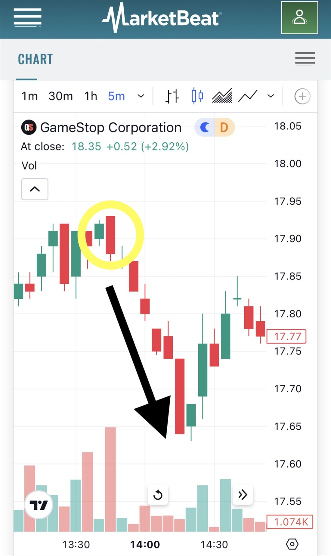
Day traders looking at the five-minute GME chart would have noticed the circled bearish engulfing candle occurring just after 1:30 p.m. If you were looking for an opportunity to scalp a few dimes, here was your chance. After the bearish engulfing pattern formed, the next six candles all closed lower than the previous one, and the stock price went from $17.90 to $17.65 before a new green candle broke the momentum. By locating this pattern, a quick-moving day trader could have earned a quarter per share in just under 30 minutes.
Candlesticks Still Require Proper Interpretation
Candlestick charts are great for short-term trading strategies because they provide investors with both the open and closing prices and the intrasession high and low. Candlesticks can be tweaked for any period; day traders, swing traders and even long-term investors can benefit from using them in both bull and bear markets.
But while these charts are helpful, they are just one piece of the puzzle regarding security analysis. Just because you see a bullish engulfing pattern forming doesn't mean the stock you're viewing has a one-way ticket to the moon. Always use a combination of chart signals and technical indicators when engaging in day and swing trading. Confirmation is key when timeframes are short.
Before you consider Amazon.com, you'll want to hear this.
MarketBeat keeps track of Wall Street's top-rated and best performing research analysts and the stocks they recommend to their clients on a daily basis. MarketBeat has identified the five stocks that top analysts are quietly whispering to their clients to buy now before the broader market catches on... and Amazon.com wasn't on the list.
While Amazon.com currently has a Moderate Buy rating among analysts, top-rated analysts believe these five stocks are better buys.